Translate

Friday, April 26, 2013

Waldorf Curriculum poster -- grade school and high school


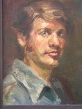
A long time ago when I was in teacher training for the Waldorf School, I created the grade school curriculum poster for an assignment to express the curriculum in any way we wanted. So I came up with the idea of making it like a game board. On my own, just after this, I did one for the high school curriculum. Now, at the expense of revealing a secret, the other students really did not like me very much. I used to do many of the assignments turning them into a song or poem which seemed to irritate the others, one of whom called me an "overachiever", not in a nice way, I thought. Secretly I gave this high school poster to one of the teachers, Ron Richardson and Magda Lissau, told him about the "overachiever" comment and asked if he would just have a look and not show it to the students. So, after all these years, I am showing it here --- although in an abbreviated manner. I get a little irritated when I see my poster showing up in places I never intended, so I've cropped my picture. What you can see is the "etheric heart" in the center guarded by St. Michael battling the dragon circling the outside of the heart. The Etheric Heart is a concept that I can't explain in 25 words or less, but some of you Waldorf people will understand. At the four corners are Celtic representations of the four elements: earth, air, fire and water, all surrounded by Celtic knotwork and color. I spent quite a while on this and I think I made my point to the directors of the teacher training. This was done in about 1993 and despite the training, or because of it, I let my artwork carry me through many aspects of the training. When you are trained to do what you do, don't suppress it. Anyone looking for the Waldorf Curriculum poster for the grade school can find what is left of them at the Madison (Wisconsin) Waldorf School. I gave them the last copies that I had. The High School poster never has been reproduced. So that's the story of that.

Thursday, April 25, 2013

Secret life of the artist -- 9


Needless to say, I hope I'm on part 9 of this series -- I've lost count. These are two views of a drawing I finished just a week ago. Traveling back from the John C. Campbell Folk School in March, I stopped for gas at small Kentucky town, Smith's Grove, north of Bowling Green. Luckily my wife likes to see interesting things and isn't one to just rush through a road trip (like me). There was a sign that said there were old church buildings in the town. We drove around and found those church buildings, but this old Farmer's Bank building is what caught my eye. This time I thought immediately of doing a drawing rather than a painting. This drawing is done primarily with 8B and 4B pencils on Stonehenge paper, 17" X 17". This took me a good number of hours and I sharpened my way through an entire 8B pencil doing it. I don't punch a clock, so I don't know how many hours -- that question comes up too many times. What most non-artists don't understand is that how many hours a painting took just doesn't matter. I've done paintings in an hour and paintings in many, many hours and been paid the same. What matters is getting the work done to the quality you expect of yourself. It just doesn't compute -- adding up the number of hours and dividing that into the price and trying to figure out an artist's "wage" -- so annoying when people do that to you. If you take a close look at the bricks and stonework on the buildings you can see they are individually rendered. That means I did each one by hand -- there's no stamp that will get you that look. Anyone who is interested in making things look a certain way will take the time ( a lot of time) to get it to look the way they want it to. So there's my hint for the day....take a little extra time and make your work stand out whether or nor anyone else appreciates the work you put into it, after all your own work will please you the most.

Sunday, April 7, 2013

Four still life paintings from JCCFS class


Attached are four of the seven still life paintings I did while I was at the John C. Campbell Folk School in Melody Boggs' still life class. The painting with the little red china piece I started on Thursday of that week intending to finish on Friday before it was time to pack up. Fortunately, I worked hard and had it finished early Friday. With time left, I decided to do one more, which then developed into two more: the two little vases each on a 6" X 8" canvas. I decided to use my pochade box instead of an easel because I was working small. The painting with the red vase is a 9" X 12" and the other with the white pitcher is an 11" X 14". The most important thing I learned was in setting them up: look for interesting color and size combinations and also textures. Textures, meaning, things like surface quality --- will it shine?, will it reflect colors from the other objects? can I paint the grapes so they have a transparent quality? can I paint an orange so that it shows the type of surface that it has? Pick an apple that has some green on it and paint the quality of that green as it moves on into the dominant red color. Or the painting with the garlic -- can I paint it so that it shows all the deep colors in it in an object that is "white", can I paint that piece of garlic "skin" so it looks paper thin? Most of all can I paint this without it looking drawn, but painted. Being accurate in your drawing can sometimes take away the "painterly" quality you are after. You are painting, sculpting and drawing with your brush all at the same time. Right now I am working on a drawing of an old building and the challenge in my drawing is to make it look "painterly", make it look like it's not an architectural rendering, like you are doing a tracing and staying within the lines. That kind of drawing and painting that is accurate to a fault just kills any painterly and lively quality that I am after.